
In this big data era, the importance of statistics does not need any mention. It helps us make sense of the data and guide us to make decisions and predictions. The major limitation of any statistical analysis, however, is in its first step — the cut-off. This is the step where you have to define what is being measured and assign characteristics to it. For example: If we want to find out the number of scientists in Klefstrom lab, a.k.a the lab I work in, we have to first define who qualifies as a scientist. The requirement to be a scientist can be a degree; such as having completed MSc or Ph.D. If having a Ph.D. degree is a requirement then I don’t qualify as a scientist, since I am still in the pursuit of it. Let’s change the parameters slightly, let’s set “one who performs experiments” as a requirement to be a scientist. Now, Dr. Klefstrom himself won’t qualify as a scientist in his own lab. He would be a grant writer and an advisor. So, for any data that is generated using statistics, it’s important to know that “how we set the parameters can change the output of the analysis drastically”.
In this blog let’s have a look at what does the t-SNE plot of your single-cell sequencing data actually means and the mistakes that can be avoided while making conclusions.
Single Cell Sequencing
Single-cell sequencing results give you data about a cell that has “n” number of dimensions, meaning that every cell you sequence has an independent location in a universe with multiple parameters (gene expression measured). Let’s say a sequencing run gave you expression data of 1000 genes (n=1000) in a single cell. Based on the differences in these genes expression levels, every cell occupies a distinct location where expression level of every gene creates one dimension. Now plot that cell in a multidimensional universe with data points from 1000 genes expression levels. You can imagine a star in the sky here with 10,000 cells that you sequenced with their individual gene expression levels. You must have a massive sky full of cells scattered all over. This is the actual power of single-cell sequencing, it differentiates cells based on their RNA expression levels. However, some cells are similar to one another than others. So, to determine these similarities we use a statistical method called the tSNE plot. tSNE plot groups the similar cells together based on the input from the researchers, therefore, it is immensely important that researchers not only focus on the clusters of cells but also on how those clusters were achieved.
What is tSNE plot?
How to make sense of something that is hanging in space with 1000s of dimensions? It’s something that we can’t simply visualize, so we project this information into a simple 2D plot. This is where tSNE comes in handy, tSNE projects the high dimensional data sets into low dimensional graphs. To understand how tSNE works, let’s project 2D data into one dimension or a single line.
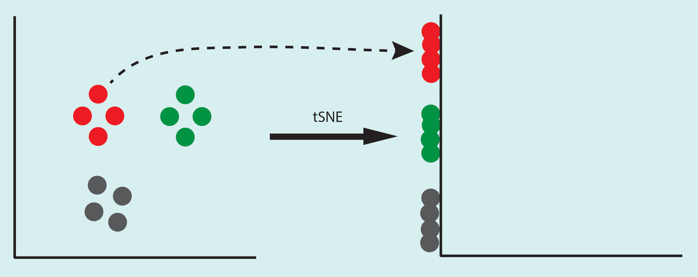
Let’s consider small circles are individual cells, if you simply project 2D data set on the Y-axis, you will get a mixture of green and red cells. If you do the same on the X-axis you will get a mixture of red and grey cells. What tSNE does is it finds a way to differentiate these cells even when they are projected on one dimension. As in the example below.

So how does it do that?
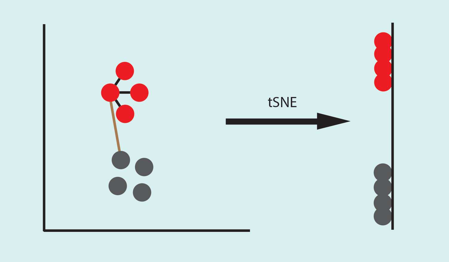
tSNE stands for t-distributed Stochastic Neighbourhood Embedding. To project the data, tSNE calculates the similarity among the points. In the example below, the distance between one red point to other 3 red points are very similar (black line), compared to the distance between a red point and a grey one (brown line). Thus the neighbors of the red point are the other three red points that share high similarity with it. In an unknown data set, the neighborhood of a point is defined by a perplexity parameter, which is the expected density of the cluster. This is a crucial step that can alter the shape of your cluster.
The advantage of tSNE is that it maintains the neighborhood of a point, meaning it tries to maintain the similarities between red points in lower-dimensional, however, it doesn’t maintain the relationship with points outside its neighborhood.
Embedding is the projection of the high dimensional point into a low dimension. In this example points in 2D are embedded in a different location on (1D) Y-axis. One of the problems during dimensionality reduction is the crowding of the points together, to overcome this problem t-distribution is used in tSNE.
Another important point to consider while analyzing data in tSNE is the step size, which is the number of iterations the algorithm runs. Let’s project the 2D points randomly on the Y-axis as shown below. In each step, similar points attract each other (red points) moving the red points closer to each other while pushing away from grey points, resulting in red and grey clusters. For this reason, steps should be set high enough so that the clusters come to a stable configuration. If not, you might get a very different cluster compared to the original data.

Conclusions
The perplexity parameter can change the cluster shape compared to the original data in a higher dimension. Thus it is good to run the tSNE with multiple perplexity values (number of neighbors) until you start to get a stable configuration. However, the perplexity value should be always less than the total data points.
Since tSNE is a stochastic (probabilistic) algorithm, every time you run tSNE you will get slightly different results even with the same input. So it’s better to make multiple runs to understand changes in your data.
The number of steps (iterations) should be high enough to allow a stable configuration.
tSNE expands dense clusters and condenses sparse ones, so the cluster size does not mean anything.
Since tSNE preserves, the neighborhood of a point, the distance between the cluster does not have any significant meaning.
By Shishir Pant